FPT Digital brand guidelines
Introducing our new
Brand Identity
The new brand identity reflects FPT Digital’s commitment to continuously evolve into a more unified and client-centric organization. It reflects our goal of playing a vital role in accompanying our partners to transform and grow in the digital economy. We’ve created this guideline to help you understand our key brand elements.


A new brand identity
FPT Digital has taken on new dimensions. Our new brand identity helps us to deliver consistent interactions and engagement with clients and partners.


Our New Visual Identity
Brand Pattern
The purpose of FPT Digital Visual Identity is to create a unified brand image system for clients, regardless of the location, the channel they connect to us or the service they use, they all get the best expression brand identity of FPT Digital.
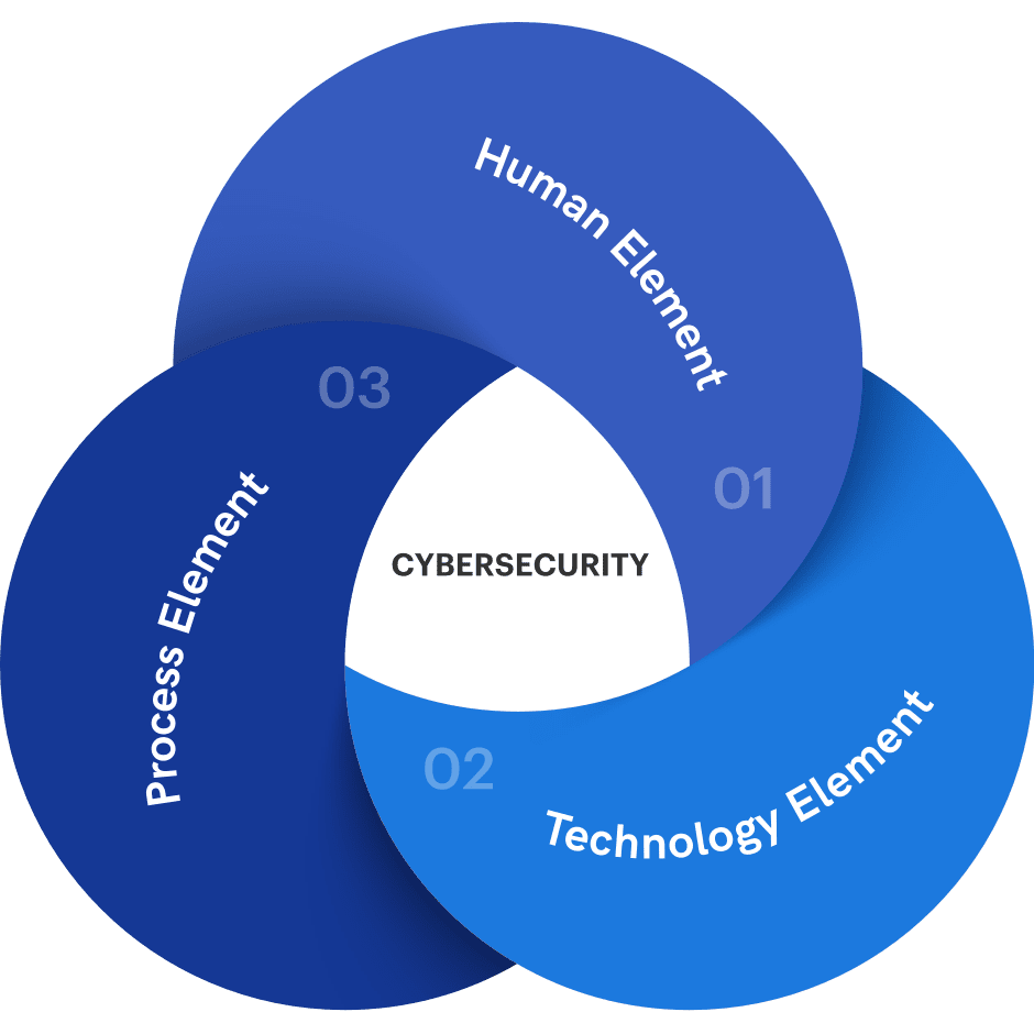
- Brand pattern is made up of overlapping circles creating movement, energy, and constant change. Flexible change is based on sustainability and stability.
- Crossing roads represent a sense of a connected system with a relationship among the 3 digital transformation elements of business, people and technology.
- These circles are dynamic, which means they are always moving and are not fixed by a definite shape.
Our Color System
Color plays an important role in FPT Digital brand identity. A supporting palette has been developed to complement the brand colors. The consistent use of these colors will contribute to the cohesive and harmonious look of the FPT Digital brand identity across all related media.
Primary colors
White
FDX Navy blue
80%
60%
40%
20%
FDX Charcoal
80%
60%
40%
20%
FDX Maastricht Blue
80%
60%
40%
20%
Gradient
Secondary colors
FDX blue
FDX light blue
FDX Cyan
White Smoke
Eerie Black
- Our primary brand colors of FPT Digital are White and Navy Blue. It is a mandatory component of all FPT Digital media publications. Secondary colors deliver a vibrant, passionate and upbeat tone when used in conjunction with FPT Digital's Navy Blue.
- Accent colors can be paired by selecting similar colors in a family (i.e. colors next to each other).
Typography
Aa
Headlines
Headlines are set in Gilroy. When using Gilroy to create headings on embedded or printed collateral for FPT Digital, always typeset it with optical kerning, set the tracking to 0, and set in sentence case. Do not set in all caps or all lowercase when using Gilroy to typeset headings on the web, set the letter spacing to -1px for smaller headlines and -2px for larger headlines.
Gilroy
ABCDEFGHIJKLMNOPQRSTUVWXYZ.,!?1234567890abcdefghijklmnopqrstuvwxyz&%#*
Graphik
Text & Paragraph
Typeset all text and paragraph text in Graphik. When using Graphik to set text on embedded or printed collateral for FPT Digital, always typeset it with optical kerning, set in title case or sentence case (as determined by the content). Do not set in all caps or all lowercase.
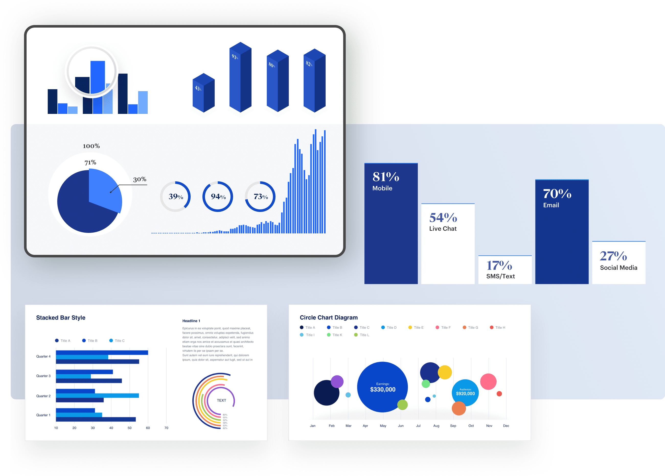
Infographic & Data Visualization
Data visualization is a form of communication that portrays dense and complex information in graphical form. The resulting visuals are designed for making it easy to compare data and to tell stories. Data visualization can express data of varying types and sizes: from a few data points to large multivariate datasets.
Infographic


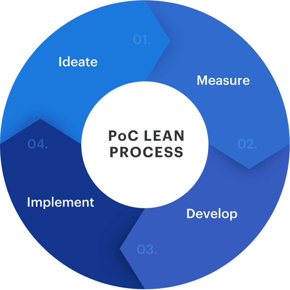

Data Visualization
Using the FPT Digital Brand Identity
Download Our Brand Guidelines
We’ve created this guideline to help you understand and know how to use our key brand elements. It shouldn’t take long to read (we kept it short).